
Written by Jan De Roeck
Marketing Director
It was a windy day in Paris, with a continuous drizzle and a touch of fog lingering over the city. Despite the weather, the view of the fabulously illuminated Eiffel Tower was as breathtaking as ever—a perfect blend of romance and grandeur that only Paris can offer.
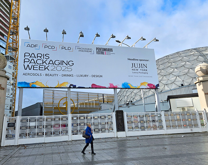
Stepping into the Paris Expo Hall 1 at the Porte de Versailles, I felt the buzz of anticipation. A long queue was forming in front of the “Collect Your Badge” counter, with industry professionals eagerly waiting to enter one of the more exciting events in the packaging world: Paris Packaging Week.
This annual gathering is where the future of packaging takes shape, where brands, designers, and technologists meet to exchange ideas, and where innovation finds its way into the hands of consumers.
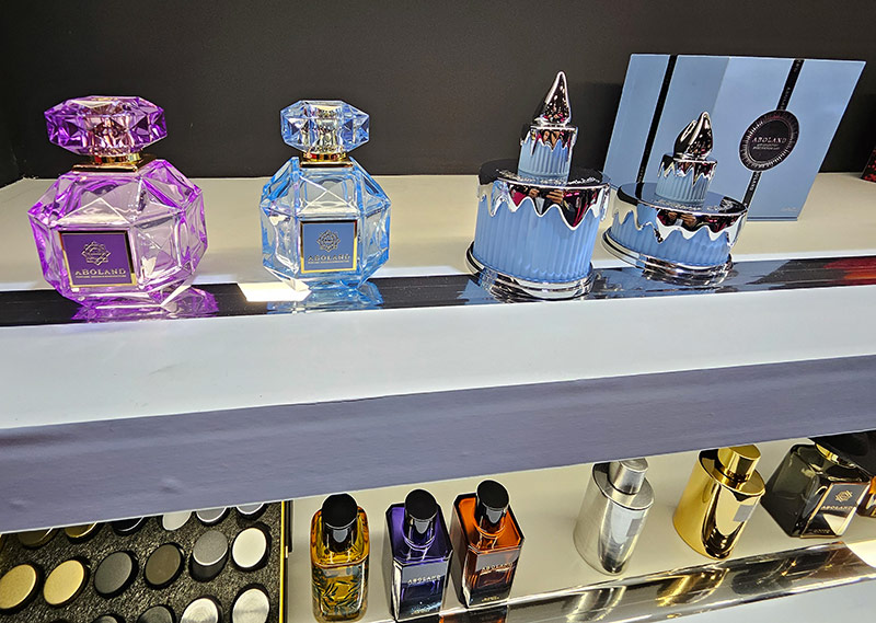
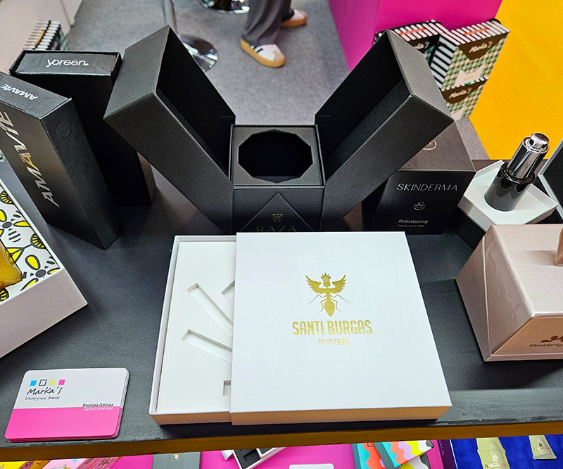
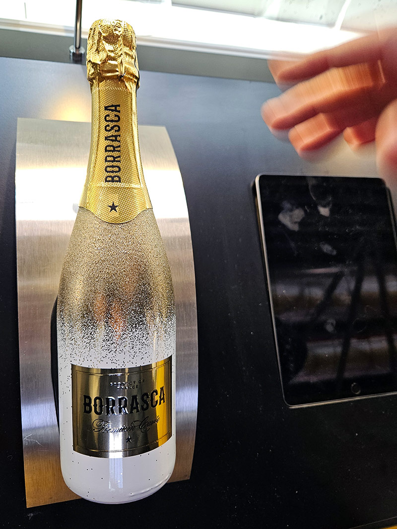
Once inside, I was greeted by an overwhelming display of stunning packaging design, particularly for the luxury drinks, perfumes, and cosmetics segment.
Everywhere I looked, there were shimmering boxes, dazzling accessories, and exquisitely decorated bottles and tubes—each an artwork in itself. The entire exhibition was a sensory feast, engaging sight, touch, and even scent, showcasing how packaging is much more than just a container—it’s an experience.
I was honored to be invited as a panelist in the Future Innovation Forum, where we explored the topic of “The Power of Color.” The discussion was moderated by Serge Odof of the ESIREIMS Packaging School in Reims, and I shared the stage with an esteemed panel: Associate Professor Benjamin Voyer of ESCP Europe, journalist Sarah Bouasse, Louis Marty, CEO at Merci Handy, and my colleague Jerome Brange of X-Rite. Together, we delved into one of the most important aspects of packaging design: color.
The Psychology and Influence of Color in Packaging
Color in packaging is far more than an aesthetic decision; it’s a powerful psychological tool. It influences how consumers perceive products, affects their emotions, and ultimately drives purchasing decisions.
In today’s highly competitive retail landscape, packaging is often the first touchpoint between a brand and its audience, making color an essential element in attracting attention, conveying key messages, and fostering brand loyalty.
Brands have long understood the emotional impact of color.
Red evokes passion and urgency, blue conveys trust and reliability, green symbolizes nature and sustainability, while gold and silver exude luxury and sophistication.
But beyond broad associations, color can also create unique brand identities. Think of Coca-Cola’s iconic red, Tiffany’s unmistakable blue, Cadbury’s signature purple, and Veuve Cliquot’s distinct yellow (or should we say orange?).
These are not just colors; they are integral parts of brand identity.
Color as a Variable in Packaging Design
One of the many topics we explored during the panel discussion was the idea of color as a variable rather than a fixed element in packaging design. Advances in printing and digital technologies now allow brands to personalize packaging colors, targeting specific consumer groups or even individuals.
Limited-edition color variations, seasonal packaging, and regional adaptations are becoming increasingly popular, adding new layers of engagement and exclusivity.
However, while personalization and flexibility offer exciting opportunities, they also pose challenges. Ensuring brand color consistency across different materials, printing processes, and geographic regions remains a critical task.
Without proper control, brands risk misinterpretation, production errors, and ultimately, consumer dissatisfaction.
Ensuring Color Accuracy and Consistency
A good starting point for maintaining color consistency is specifying a Pantone reference.
However, a Pantone guide alone is not enough to uniquely define a color. Colors can appear different based on the substrate, print technology, and lighting conditions.
To truly standardize color, spectral data measurement is required—this ensures that color is specified in a way that leaves no room for interpretation. With CXF as the ISO standard file format for color communication, this detailed color spec can easily travel through the production workflow from one stakeholder to the next.
Taking color accuracy even further, PantoneLIVE digital color libraries offer an advanced solution. These libraries provide precise color definitions based on how a Pantone shade will appear when printed on a specific substrate with a given print process.
This level of precision gives brands a reliable expectation of their color’s final appearance, reducing discrepancies and production errors.
To achieve the best results, brands must establish constraints for their packaging production early in the process. Key factors include decisions on ink gamut, print process and substrate.
Setting these parameters in advance not only ensures color fidelity but also prevents budgetary surprises, reducing the risk of costly revisions, wasted materials, and potential damage to brand reputation.
Where Emotion Meets Technology
Paris Packaging Week is a unique stage where the worlds of design, psychology, and print technology intersect. The conversation about color was not just about its aesthetic appeal but about its role in consumer perception, production feasibility, and brand consistency. The fusion of emotional impact with precise print execution is what makes packaging truly powerful.
Being a part of this discussion reinforced how essential it is to bridge the gap between creative vision and technological implementation.
Brands that master both aspects—emotive storytelling through color and rigorous production discipline—will have a competitive edge in today’s dynamic marketplace.
As I stepped out into the misty Paris evening, with the Eiffel Tower still shimmering in the distance, I felt a deep appreciation for the artistry and science behind packaging design. The future of color in packaging is not just about making things look beautiful—it is also about approaching color reproduction as a consistent and cost-conscious production process.
Not only the packaging design, but also each mass-produced package is meticulously crafted for perfection, becoming a true brand ambassador.